Vanarama
At the end of 2019 I had the pleasure of working with the folks at Vanarama.
They wanted to refresh their existing brand identity and modernise it.
Vanarama are a well established van hire company that are now expanding in car hire too.
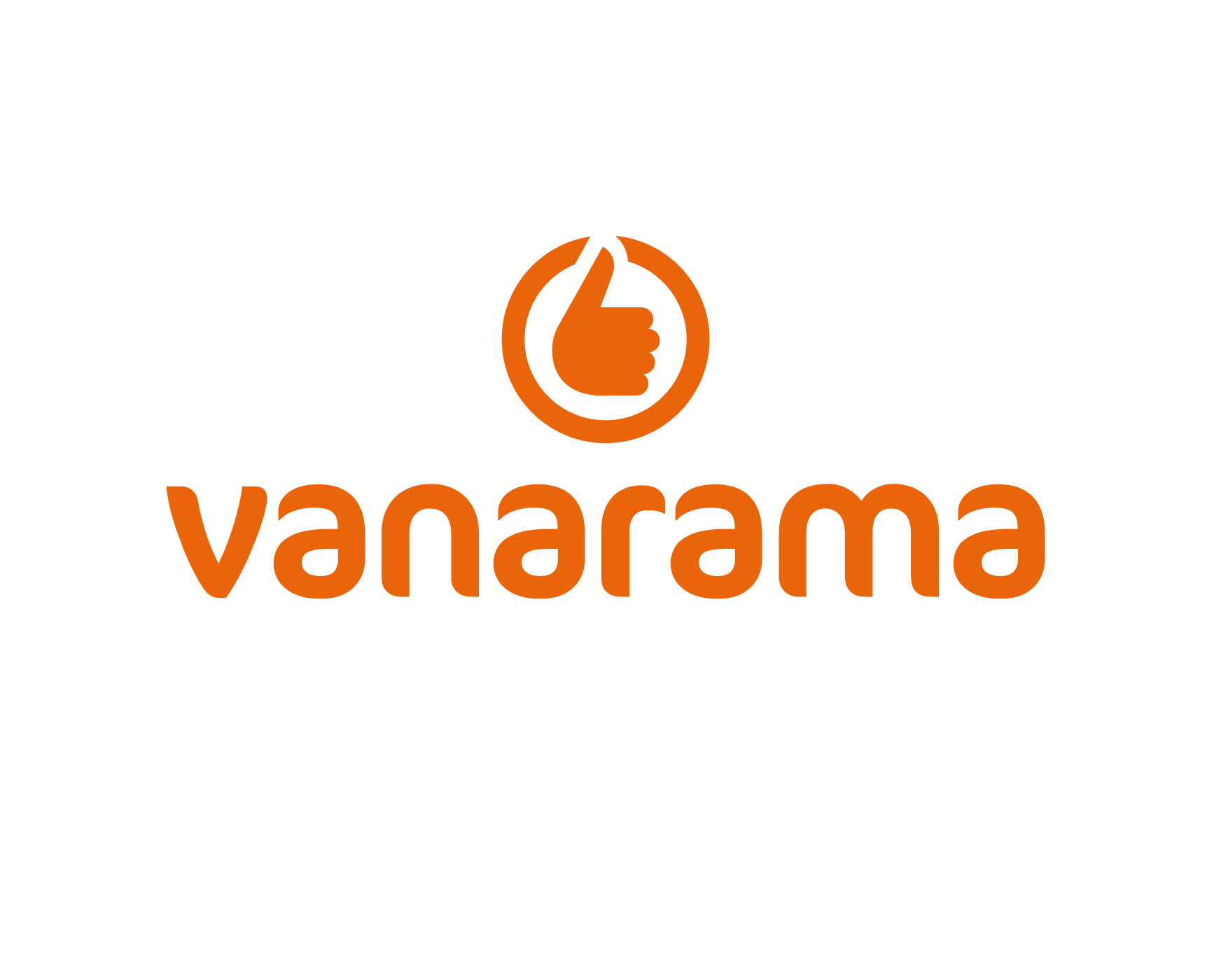
Their main brand colour is orange and black. I wanted to celebrate the vibrancy of their orange and bring
this to the forefront of the brand. The thumbs up icon which has been a strong part of their brand for years was
also essential to keep. By bringing this up to date I think we achieved a great, modern and timeless logo.
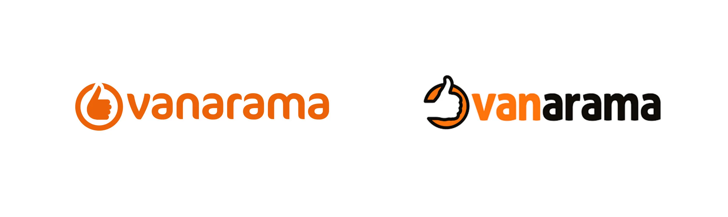
Before and after
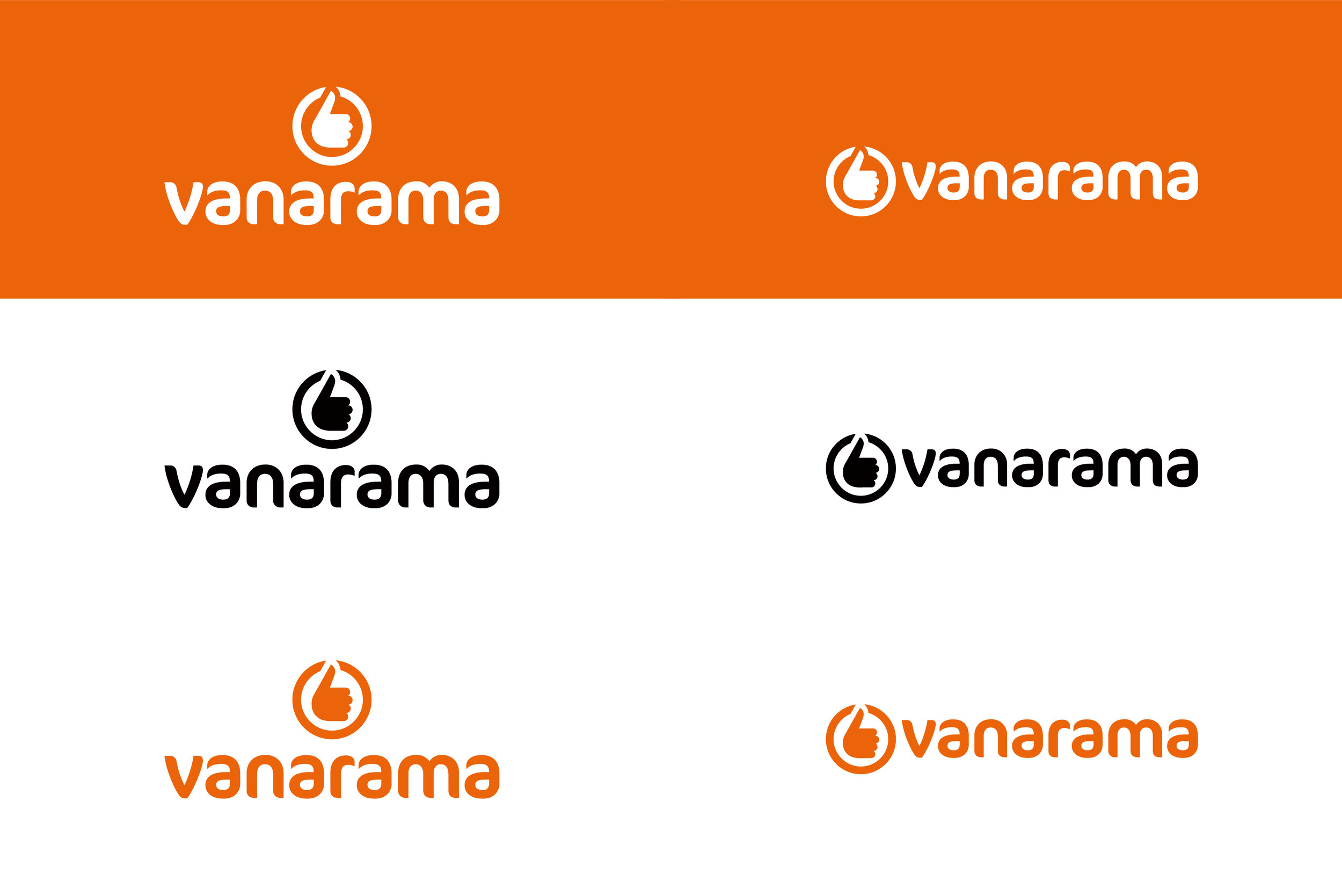
Vanarama logo variants. Two logos were designed to enable positioning versatility

How the new brand identity works across the website and mobile apps


Vanarama National League - How the new branding works

Suggestions making the photographic style. Use of orange lens flare makes the photography feel on brand.